There has been more than a bit of discussion on social media and forums about the 3D nature of the proposed new West Ham United crest which appeared at the end of the presentation video.
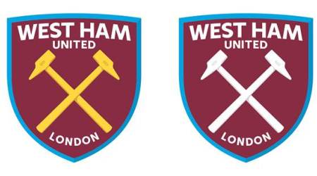
But four images released via West Ham United this afternoon show how traditional flat and single colour versions of the crest would look.
As you can see, these are very similar to some of the mock-ups produced by fans on the online forums.
These versions of the crest are provided alongside the following information of how these different versions would be used, should supporters endorse the Club’s plans:
The two shades of claret are a graphical representation of the HMS Warrior’s bow, the inspiration behind the new crest shape. However, they will only ever be visible in a 3D form and this is not how the crest will appear in the majority of its applications. The 3D presentation of the crest will primarily be used across digital platforms.
As the following variations show, the two shades do not apply to single colour versions of the crest, nor to the more traditional flat crest, as would appear on the playing shirt.
The proposed crest has been carefully designed to be adaptable with a variety of colour applications and will follow a colour palette that has represented the Club’s historic colours since 1900.
The Club say they are still fully absorbing feedback and, should there be overall support for the direction of the crest, these factors can be considered and potentially incorporated ahead of producing final brand guidelines.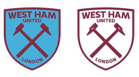
KUMB are holding a straight YES/NO/Unsure poll and when I last looked it was 17% – Yes, 67% – No and 15% Unsure.
It seems that the ‘punters’ are not impressed with all this phoney marketing guff!
I think its been proven polls change nothing at the club and yes your view is just as valid
I think it’s been pretty well proven polls are pointless don’t you
The four designs are all the bloody same. 4 quarters in claret and blue with the crossed hammers and 1895,job done as far as im concerned, #coyyyyyyyyyyyyyyyyy.
….. Oh, and why use the word ‘London’ – I can think of at least ten other ‘London’ clubs with varying levels of history – why does West Ham have any more claim over the word than these others.
Historically, West Ham was in Essex and I can’t see any clamour for that to be added to the Badge – and I say that as an Essex lad.
If it’s not broke don’t fix it!
I know you well enough to understand that you can answer your own question there Mick 😉
To be honest I think it bland yes like the 60’s.The Heater shield could be more curved possibly with a slight point at the middle top, good to be rid of the castle but perhaps we should retain ther banner at the bottom possibly a simpler one, I’m happy with the colourways, but why not “East London” and definitely 1895….what is needed is modern and Heritage combined..lets not be fobbed off….
I notice David Gold ‘bigging up’ the new Crest on Twitter – looks like a done deal to me – so much for the Consultation!