 West Ham fans are hoping that photos of the new shirt sleeve sponsor’s logo are only photoshopped mock-ups which will improve when used for the first time on West Ham shirts for real.
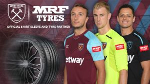
Supporters pointed to white type face logo on a red background sticking out on the current home kit and pointed to the much better designed Manchester City kit with a transparent background for their tyre sleeve sponsor on how it should be done.
Some called the mockup hideous while others took to social media to say it was plain ugly and embarrassing.
West Ham’s ribman Mark Gevaux said “I KNOW it has been photo shopped on to the shirt but it looks DISGUSTING”
Newspaper journalist and West Ham Jim Munro said with his tongue in his cheek “Wow, that’s amazing. I’ve had sleepless nights fretting over our lack of sleeve sponsor. And it makes the kit look great!”
“Supporters pointed to white type face logo on a red background sticking out on the current home kit..”
Err, if you were a sponsor, forking out mega bucks, isn’t an advertisement that stands out exactly what you want? Or would you prefer something transparent that blends into the background? You know, spend the money and hope people won’t notice your advert too much?
I honestly couldn’t give less of sh#t.
The things people manage to moan about.Just staggering.
It sums up some of our lot perfectly.A bunch of Stella McCartneys….
Of all the things going on in the world atm what a sponsor’s logo looks like is pretty much irrelevant. Who really gives a t0ss?