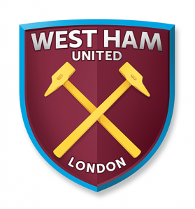
 Comments on social media suggest the initial reaction to the Hammers crest redesign is not good!
The main complaint is the the ‘cartoon style of the image’ with some suggesting it has been designed by the Simpsons.
Others object to the inclusion of the word London, the type face, the colour of the hammers, the 3D effect and the lack of blue in the final design.
Personally I think the badge will grow on us in time. We recall the initial feedback on the 2012 Olympics logo when it was first launched with some suggesting it was drawn by a child with crayons. In fact it became an iconic image world wide.
While there are small details I would change on this design I support change regardless. If the choice is this crest or sticking with the current badge I’ll vote for change.
The official poll closes on Friday 6pm, so make your vote count whatever your view!
https://start.yougov.com/refer/v0Vgd8jpPpyJM5
I don’t see what all the bloody fuss is about it’s only a badge.. i think it would make a great screen saver 🙂
If it ain’t broke…….