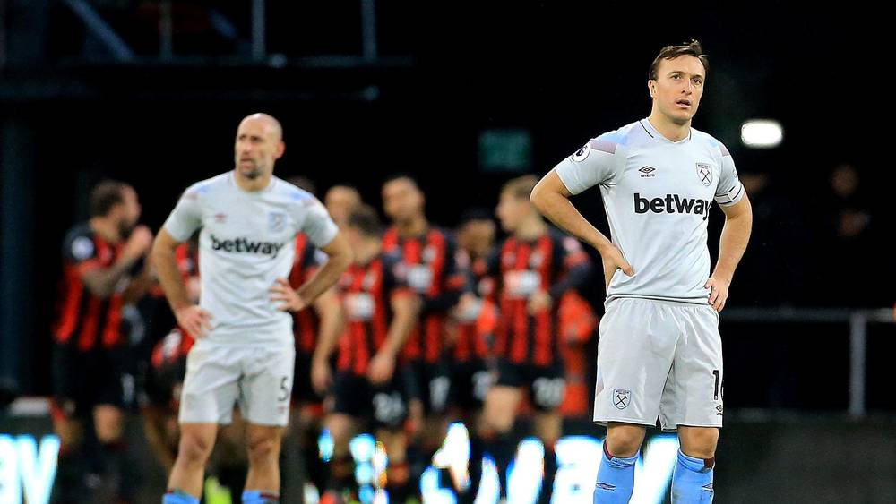
West Ham are yet to win when playing in their third kit this season after four games in the offwhite shirt
The Hammers kicked off the season in August with the new third kit at Anfield only to lose 4-0 to Liverpool.
Next up was Burnley away in December last year with a 2-0 loss at Turf Moor, the new year bought another 2-0 loss wearing the third kit this time away to AFC Bournemouth. Playing Crystal Palace away this weekend was the fourth time we have played in the third kit this season and while we managed a draw we wait to record a win wearing the third kit.
West Ham’s away kit for this season is Teal, a Greenish/Bluish colour which was deemed to be too close to Crystal Palace’s blue shorts.
It may not be the last time we see the offwhite third kit this season for the Hammers, our luck in these shirts has to turn at some point, hasn’t it?

What’s wrong with sky blue and two claret hoops, Sky blue shorts and socks, as an away shirt.
Nothing is obviously wrong with it, we just don’t have a strip that fits that description.
Somehow I don’t think our performances in any of those four games was predicated by the colour of the kit we wore.
Its an awful bit of a design, had it been white it would have looked better, the other two kits are good.
Absolutely. It’s the best away strip ever and should always be one of our kits. Proper White has been good in the past, too. Teal? Off White? Honestly …
Ha ha – I mentioned this a couple of weeks ago. I’m not superstitious, I just think it looks awful; dirty white. I like the second strip which I thought was blue – it looks like a top club’s threads. I guess with our crossed hammers being gold we could try a gold third kit – perhaps a wolf badge might help as well 😉
Just looks like the colour has run. Drab,dull and very “Sunday pub team” strip.