Hammers show massive improvement

How much has been another question but a member of the ClaretandHugh Facebook Group @https://www.facebook.com/groups/363174467150521/ has come up with a chart which claims to show that it has been pretty substantial.
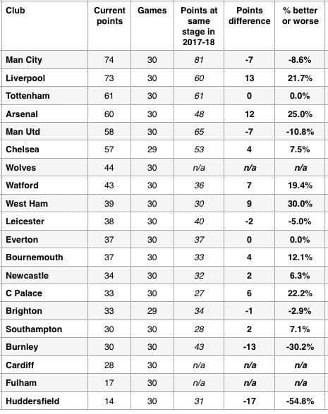
Sadly the source of the table is unknown but such is the detail shown that it certainly appears to be genuine and show every club ‘s performance comparison between last season and this at the 30 game mark.
Most show a small percentage either way with Huddersfield, as an example, making a significant drop of around 40 per cent.
The biggest improvers are the Irons with a very impressive 30 per cent with 9 points more than at the same point last season.
We can see no reason to disbelieve the figures and as probably most would agree, we re going in the right direction under Mr Pellegrini