New Irons kit: Total condemnation from fans
Images of what could be West Ham’s new home shirt have been leaked on the internet and fans and followers of ClaretandHugh have reacted with total disgust
We have received one good word about the top and here are a selection of random comments from the website forum.
Frankly it’s very hard not to agree!

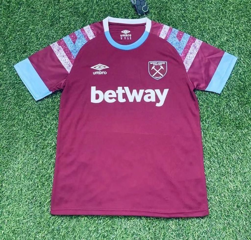
- Whoever designed that home shirt needs a change of career. Leave colouring to primary school kids who do it better
- That’s horrendous! I never liked the old BAC shirt and this one is even worse!
As an old traditionalist I like to see Sky Blue sleeves and a Claret body, White shorts and WHITE socks. But hey.
- They look like a toddler’s outfit and a ref’s outfit to me …..oh well! We all know that our classic first team kit is as good as any and our classic away strip is THE BEST anywhere, anytime.
- I have to say, I’m a little disappointed (if this is official )
I have liked the past few years and it’s been a good a idea to bring some back.
I Guess they can only do so much with the home kit, and you really can’t beat last year’s away.
- Is it just me or are those two kits not just dog-ugly? Personally I prefer to wear a classic design that is immediately recognisable as West Ham, and not something that looks like
the worst offering conjured up on a Friday afternoon by a classroom of 6 year olds wearing blindfolds.
- This has got to be the WORST KIT EVER and I include the PONY in this statement, it’s hideous, I do like the black and orange as a 3rd choice but why move away from the pale blue or white ?? Hate it/ Designed by someone on an acid trip
- Yuck and yuck