


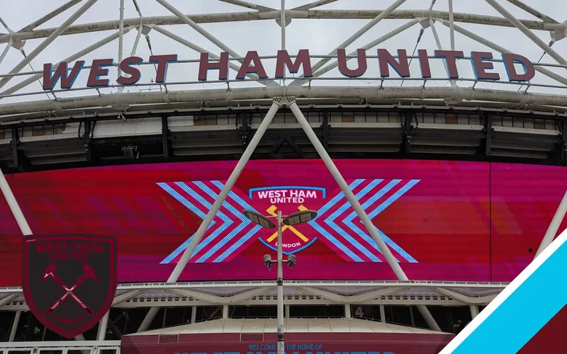
Despite the current power struggle behind the scenes, West Ham United’s board are following through on one of the promises made early on following David Sullivan’s hasty departure.
Those halcyon days of June when it seemed that Kretinsky’s ‘brave new world’ was set to envelop the club and supporters in post-‘BS’ optimism have been derailed somewhat by the arrival on the scene of Amanda Staveley’s hostile takeover bid.
However, one of the processes set in motion back in June is set to gather pace, as the club keep to their commitment to consulting, and then changing, the club crest – that’s the badge to you and me.
The newest version from 2016 for many symbolised the commercialism of the Sullivan-Brady era, thanks to the tourist-friendly ‘London’ addition and the removal of the castle which first appeared on the crest in the 1960’s.

The West Ham web site offers fans an opportunity to have their say on the new-era club crest:
“Forging Our Future- Deciding the future of our crest, together” (click the link)
As the page explains:
“This survey is the first phase of our crest consultation process and has two objectives:
-
-
- To find out whether supporters would like to see our current crest changed
- To understand what it means to be a West Ham United supporter and how that could shape any potential new crest design
-
This survey is just the first round of consultation. If a majority of supporters agree that the crest should be changed, the Club would use the results to create multiple new design options . You would have the opportunity to give your view again later in the season by voting on the different crest designs.
Any final design would be implemented in the summer of 2028 in time for the start of the 2028/2029 season.”
However, the survey isn’t open to fans who attended less than five games last season: Head on over and read the full list of qualifying factors.
So fans should head over and make their own opinions known. Hopefully once the shareholder situation is better known – next month looks likely to tell us much about Kretinsky’s shareholder situation -the club will follow through on other initiatives to move West Ham back towards a fully engaged fan base with a new look, listening and fan-friendly board.
Definitely the claret and blue 2020 without the ”125 years’ motto.
I don’t qualify but mum was born in Upton Park and her uncle Jack, family history has it, played for Thames Ironworks. My first game was in the late 40s against Bury in the second division and saw Bobby Moore play dozens of times. So I care what the badge will look like. COYI
exactly, one of those 3 👍 not sure about 2, though
1958, 2020 & present (last two without London and 1895 instead). Why we need the castle back I don’t know. That was the Boleyn. We are no longer there.
Bring back the castle! Just because weve left the Boleyn doesnt mean we should turn our back on its heritage. Maybe we need some false turrets at the front of the OS too! 😉
I get what you’re saying but the castle was only added in late 60’s. So not a huge heritage call. But everyone’s got their opinion. Boring world otherwise!
I always thought those fake turrets looked very tacky.
Anything that would remove any trace of the 3 who’ve temporarily wrecked us.
Been a WH supporter since 1958 so seen most of the badges. My personal favourite is 1999 but will go with the majority . They will not get it wrong ⚒️
PS can you suggest we all stand and sway when dining bubbles like the good old days !
Its open for any membership. I haven’t attended a game in 3 years due to caring for my mother with dementia but I’ve kept my claret membership going so yesterday I filled out the survey
Thanks for supplying all the crests Martin. When I first supported the team in the early 70s it was usually the simple crossed hammers and I went for that in the survey. But I’d also be happy with the 2020 badge which looks great, minus London and with 1895 at the bottom. I seem to remember at least one season, around the Jimmy Greaves era, when there was no badge at all!
Yes, I have a photo somewhere of Bobby Moore wearing the away shirt with the hoops around the middle, and no badge.
I have a replica of it.
My preference of the above: 1975, 1999, 1923. Whatever the final choice, if change happens, the crest should be clear, clean and unfussy, in claret and blue. The name isn’t needed, but of course it’ll be there for commercial reasons. No chance of two? One crest and one commercial badge?
exactly, one of those 3 👍 not sure about 2, though
Get that stupid word London out. Remove every single trace of those vile monsters. I want to wake up and know it was a nightmare.
Personality, 1987 without the club name underneath. Simple claret and blue colouring.