
Somebody, it seems, has been listening at West Ham United, through all the protests of the last few months and years. The new board need to be congratulated on acting so swiftly in starting to put fine words into actions following the depths of the Sullivan – Brady era when fans were simply ‘customers’ to be milked shamelessly.
Up pops a new announcement on the Hammers’ official web site today, proving that the new- era West Ham board have their ears very firmly to the ground in a move that will delight supporters:
“West Ham United is pleased to inform supporters of the launch of a new fan consultation on the future direction of the Club’s official crest.”
“On the anniversary of the formation of Thames Ironworks FC in 1895 the Club can confirm that a full and comprehensive supporter-led process will soon begin to ensure its world-famous crest best reflects the Club’s unique heritage, identity and culture.
The consultation process will run throughout the 2026/27 season and any changes will come into effect for the start of the 2028/29 season to allow appropriate time for manufacturing and production deadlines. This extended period will also ensure sufficient time for a thorough review, with supporter feedback at its core and the FAB playing a significant and independent role throughout.“
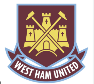
The web site then goes on to explain – with a fairly plain dig – that the new crest was changed in 2016 to co-incide with the London Stadium move.
If ever there were visible signs needed that this West Ham ownership is looking to be true to its word and reinstate the heritage and the link between fans and owners, this simple yet very sensible consultation gives supporters back a sense of involvement and engagement in their own club.
We all have our favourites – but fans now to be consulted. Excellent.
Every fan will have their own favourite crest, no doubt some will prefer ‘as is’ but that isn’t the point. It is now the supporters who have their say rather than have a design imposed upon them. Happy days.
That’s the one for me. The one with the castle. Bring it back please.
Ever the One for a Compromise try this
See postwith Picture on X
Ever the One for a Compromise try this
The current third team kit with a pair of crossed gold hammers on its own looks fantastic. But I agree with Paul – if we keep the current first team crest with 1895 instead of London, that would be fine. As a fan of the earlier, simpler crests (I’m in my 70s), I was against the introduction of the castle at the time, and see no reason to bring it back.
There are two castles in our history, way back in 1895 Thames Ironworks FC came into being incorporating Old Castle Swifts. Castle Swifts is where our pale blue comes from, claret being the commercial colour of the Ironworks.
Old Castle Swifts were the works team of the Castle shipping line, later the Union Castle shipping line, their works were just across the creek from the Ironworks, directly opposite.
Then when we moved to The Boleyn in 1904 there was a castle like octagonal single turret fronting onto Green Street, it was there until 1955, it was The Boleyn Castle.
The Castle is important and should be reinstated in some way, it’s arguable that the Castle came before the Hammers.
The badge on your article is the best one by a country mile and should be re-instated immediately.
Credit where credit’s due. They seem less tone deaf to the fans.
Keep with the crossedhamers, it looks much better without the Castle and is more traditional going back to the Thames Ironworks
I agree. Just change the London to 1895. We are no longer at the Boleyn and TIW are represented by the crossed hammers.
Agree with the above.
And to be honest, the badge is the least of our worries. Championship teams will be delighted to know this is where our focus is right now!
Totally agree. Change London to “TIW 1895” – Less is more.