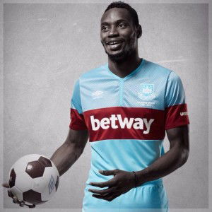
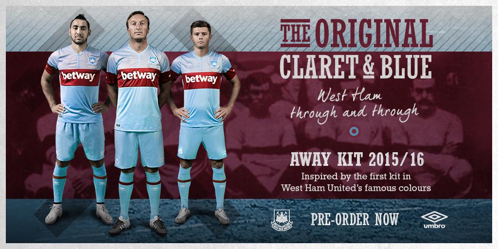
 West Ham have unveiled their new 2015-16 season away kit this morning.
The new-look strip is understood to be heavily influenced by the historic ‘Union Jack’ design, which was worn between 1901-03 – when Queen Victoria and King Edward VII were on the throne! It features a light blue shirt with single claret chest hoop, light blue shorts and light blue socks with claret hoops.
Pre-orders will be delivered on 29th July and the kit will be available to buy on the same date for men, women, juniors, infants and babies.
The Hammers are set to wear the away kit for the first time against Birkirkara in Malta on 23 July.
Just had a look on the official site but can’t make my mind up these things often look better in reality,my main question is what have they done to Nobes head in the picture lol
haha… whufc just took photoshopping to a new level.
The same treatment would make the junior Viking look tougher lol
Btw still want him to start tomorrow
Well.. there’s an upside with Viking Jr.`s looks, there’s not a nightclub anywhere that would let him in. He’ll probably have trouble walking into a cinema without an adult!!
Yep, bring him on!!
I like it this year the history is important and this is where it all started and was the inspiration for the hooped shirts that came later so if we don’t do it this year then when? But yes Nobes head is rather scary rather like he has been a guinea pig at an A Bomb test.
He reminds me of Crighton from Red Dwarf,maybe with all this talk of him losing his place he’s been replaced with the Nobot 3000 lol
Love the design, like the single hoop more than the normal two & the claret on the sleeves is pukka… Don’t think i’ll be rushing out & buying one though.Is it just my wonky eyes or does the shirt look shiny & a horrid collar?? The picture’s make Noble & Cresswell look like there are taken off FIFA 16.. lol hahahaha
You’d have thought they’d have included a Union Flag on it somewhere as well…
Cracking shirt,i love it,best i have seen for a while..Back into my bunker.
Going on site to buy one now agree with you Rads just hope the quality is good,
Wonder what hippo thinks about it as he seems to think he still has a say in the club ?
It’s OK. Could’ve been so much better though. It will look best from the stands.
I would’ve preferred another version of the famous 60’s double claret hoops with the same style neckband as the fantastic home shirt, but hey!
At least the team’s kit man can mix’n’match the shorts and socks successfully for a change. Playing Aston Villa and Manchester City away has sometimes brought it’s colour clash problems over the years.