I am Season Ticket Holder in West stand lower at the London Stadium and before that, I used to stand in the Sir Trevor Brooking Lower Row R seat 159 in the Boleyn Ground and in the Eighties I stood on the terraces of the old South Bank. I am a presenter on the West Ham Podcast called MooreThanJustaPodcast.co.uk. A Blogger on WestHamTillIdie.com a member of the West Ham Supporters Advisory Board (SAB), Founder of a Youtube channel called Mr West Ham Football at http://www.youtube.com/MrWestHamFootball,
I am also the associate editor here at Claret and Hugh.
Life Long singer of bubbles! Come on you Irons!
Follow me at @Westhamfootball on twitter
Looks ok to me. A bit like Burnley but I still like it
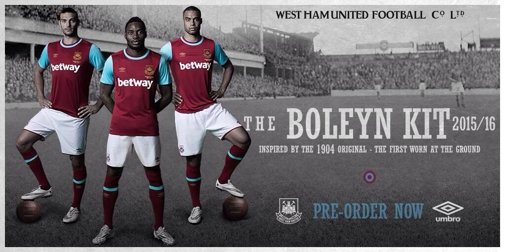
1 year of a great Adidas kit to this… not a good kit at all. Far too basic but then again what do we expect from Umbro
Agree with that, its hardly a tribute to our last season at the boleyn am completely underwhelmed by this dull shirt. The adidas kit was the best we have had since the 80’s when we had the last adidas kit. Hopefully under Slaven we can play better football and attract more lucrative shirt sponsorships with shirt designers that care, when this deal runs out, either that or get someone into umbro that has some imagination and design talent.
Underwhelmed is exactly the word I used.
Nice kit!! I like it!!So it looks a bit like Burnley or Villa!!What a shock,they play in claret & blue!! It aint going to look similiar to Liverpools is it!!!
Last seasons didn’t look like Burnley..
Lol,ofc its basic,its a take on the 1904 kit.I like it actually.Preferred last years for sure,smart kit.But i aint going to spit my dummy over a bit of cloth 😀
Love it!
Old school, stripped down and minimalistic! Like it!!
Ffs,who cares whether it looks like burnley or villa.Its a West Ham kit.I know this coz the badge tell me this,lol,suprised someone hasnt said it looks like s****horpe or some other random team that plays in c&b.Personally it aint inmportant to me.Who we have inside it on the pitch is more important.The shirt aint going to win us 3 pts.The geezer inside is 😉
Glad my swear filter working! Lol… What’s the only club with the c word in it! Ha ha!!
Lol,yeah i forgot it would blank it out Jeff.You swear filter is a right S****horpe 😀
not bad, though I preferred the Adidas kit… ahah anyway the designers forgot the crutch near Andy… lol 😀
Haha,at least one good sign in this pic.’Captain’ Nolan is absent from it.Got to be a good sign for the coming season 😀
ahah.. or maybe the extension of Nolaninho’s contract will be the big surprise in order to increase the season tickets… 😀
Love the shirt, stuff Burnley and Villa with
What happened with the new logo, Everything on ice?
hope so, absolutely love the one we have.
You mean the new badge Eriko?That is first season at OS from my understanding 😉
Nice kit.Aint got no issue with it.It is what it is,a claret & blue football kit.Whats it ment to have on it,padded shoulders,flashing lights round the neck,little fluorescent hammers tap dancing on it 😉
Laughed
If they wanted the retro look then I thank they have achieved it. Wasnt ever going to be hard to replicate was it. Would look better if the Betway logo was also in gold and would like to see the same for the name and number on the back. Something to just make it a bit different for the last season at UP.
Spot on design – they weren’t flash and glitzy back then. Excellent